In the previous post, we covered how to connect to daily market trading data from Yahoo Finance, using the pandas-datareader module to load the data into a pandas dataframe in Python.
In this next post, we look at how to graph the data, using another useful Python package called matplotlib.
We are going to extend the existing Python script created in the previous post, which is repeated below:
import datetime as dt
import pandas as pd
import pandas_datareader as pdr
import matplotlib.dates as mdates
import matplotlib.pyplot as plt
# register converters (otherwise a FutureWarning is thrown)
pd.plotting.register_matplotlib_converters()

# target stock details
stock_pick = '^AORD'
start_date = dt.datetime(2019,1,1)
end_date = dt.date.today()

# get stock data
df = pdr.DataReader(stock_pick, 'yahoo', start_date, end_date)

# print stock data
print(df.tail())
To install the matplotlib visualisation package, in a terminal type the following:
pip install matplotlib
Next we need to import some modules from matplotlib. Add the following to the import statements at the top of the Python file:
import matplotlib.dates as mdates
import matplotlib.pyplot as plt
# register converters (otherwise a FutureWarning is thrown)
pd.plotting.register_matplotlib_converters()
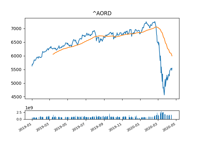
The chart that we want to graph will include a standard line graph, with moving average and a volume bar graph underneath.
Let’s first add a fifty day moving average column to our dataframe. At the bottom of the Python file add the following code:
# create a moving average column in the data
df['m_avg'] = df['Adj Close'].rolling(window=50).mean()
We need to set up two graphs on different axes within the same grid (using the subplot2grid function). For the line graph, we use ax1 and for the bar graph, we use ax2:
#set up axes for different graphs
ax1 = plt.subplot2grid((10,1), (0,0), rowspan=8, colspan=1)
plt.title(stock_pick)
# scale both graphs to ax1
ax2 = plt.subplot2grid((10,1), (9,0), rowspan=1, colspan=1, sharex=ax1)
To create the plots, we use the date on the x axis and the different dataframe columns on the y axis:
# graph data using date(index) as x axis
ax1.plot(df.index, df['Adj Close'])
ax1.plot(df.index, df['m_avg'])
ax2.bar(df.index, df['Volume'])
Depending on how much data is being graphed, the tick labels on the axes can sometimes become a bit busy. I found the following to work best for this use case, but it may need to be tweaked depending on alternate use cases:
# format axis tick labels
plt.xticks(fontsize=8)
plt.yticks(fontsize=8)
# scale date ticks dynamically
plt.gcf().autofmt_xdate()
Lastly, we need to render the plot, which we do by calling the following:
# display the chart
plt.show()

If you want to export the chart to a file, an additional line of code can be added before you call plot.show(). This will save the image in the same directory as the Python script:
# save the plot image (optional)
plt.savefig('./chart.png')
As before, the Python code can be downloaded from my Github page.
In the next post, we look at analysing per share statistics.