With the current season that we find ourselves in, it is difficult not to get sucked into the daily numbers that are published around worldwide COVID-19 pandemic. The data that is being tracked and collected to help us understand this health crisis, provides an interesting opportunity for analysis.
There are many interesting ways to slice, dice and analyse all the data from various sources, however being an auditor and hence a natural skeptic, the first thing that piqued my curiosity was how a Benford’s Law analysis of the data may look.
Benford’s Law, named after physicist Frank Benford, observes that the frequency distribution of the first digit of all numbers contained in real-life populations that meet certain characteristics, follow a predictable pattern. The leading significant digit frequency decreases from the first digit as “1” (highest frequency of approximately 30%) to the first digit as “9” (lowest frequency being less than 5%). The Law can also be applied to other positional digits (second, third, etc) or groups of digits. If you are interested in the how the digit frequency distribution is calculated, refer to the Wikipedia page linked in the paragraph above.
Interestingly, Benford’s Law does not appear to be confined to the base 10 number system and can be adapted to apply to base 16, for example.
As mentioned above, the Law only holds on datasets that meet certain criteria. Data populations with no limiting minimums or maximums that are spread out across multiple orders of magnitude, especially where exponential fluctuations are present, are most likely to approximate conformity to Benford’s Law.
Application of the Law can be useful to detect inconsistencies which may indicate the presence of fraud and is even admissible in court in the United States. Although, it should be noted that the phenomenon is not a magic fraud detection algorithm and a fair amount of work is usually still required to pinpoint evidence of actual fraud taking place.
Given the exponential growth rates characteristic in a pandemic such as COVID-19, it seems like a good candidate for analysis with Benford’s Law, together with some Python code.
So first things first, we need to get hold of a dataset that we can work with. One of the most popular data sources is hosted on Github by Center for Systems Science and Engineering (CSSE) at Johns Hopkins University. We are interested in the global time series data hosted at this link, but don’t worry to download the data, we will import it directly into our Python code.
It is assumed that Python, as well as the Python packages Matplotlib, Pandas and related dependencies, are already installed on your system. Refer to my previous posts on working with stock market data if you need assistance with
pip installing the above packages.As mentioned above, we will be using modules from the
pandas and matplotlib packages. In addition, we will also need to use Counter to summarise the digit frequency, as well as the log10 function to calculate the expected Benford’s Law digit frequencies.Let’s get started by importing the following:
import pandas as pd
import matplotlib.pyplot as plt
from collections import Counter
from math import log10
Next, we need to access the raw datafile with cumulative daily cases and load the CSV into a pandas dataframe in the variable
df_cases:# data source https://github.com/CSSEGISandData/COVID-19 path = 'https://raw.githubusercontent.com/CSSEGISandData/COVID-19/master/csse_covid_19_data/csse_covid_19_time_series/' # create a dataframe for cumulative cases updated daily file_cases = 'time_series_covid19_confirmed_global.csv' df_cases = pd.read_csv(path + file_cases)
The data for some countries, where information is reported for every state, extends across multiple rows in the data. We thus need to group these rows, place the results in a new dataframe (
df_cases_grp) and since we don’t need co-ordinate data for our exercise, we might as well drop the latitude and longitude columns as well:# drop latitude and longitude df_cases.drop(['Lat', 'Long'], axis=1, inplace=True) # group by country (some countries have state data split out) df_cases_grp = df_cases.groupby(['Country/Region']).sum()
Select a target country (
'South Africa' in the code example) and create a new dataframe, country_data, to hold the cumulative daily cases for that country. We also need to add an additional column to hold the new daily cases, by calculating the difference between daily cumulative cases:# Select country country = 'South Africa' # set up the dataframe country_data = pd.DataFrame() country_data['Date'] = df_cases_grp.loc[country, '1/22/20':].index country_data['Cases'] = df_cases_grp.loc[country, '1/22/20':].values country_data['New'] = country_data['Cases'] - country_data['Cases'].shift(1)
Print the dataframe to screen and make sure it looks as expected:
print (country_data)
Visualising the data with Matplotlib can also help with checking if all looks good:
# graph the daily cases (excluding x axis labels)
plt.bar(country_data['Date'], country_data['New'])
plt.title('{} (daily cases)'.format(country))
plt.xticks([])
plt.show()

To keep track of the first digits in each new daily case data point, we create a
digits list by looping through all the new daily cases and appending the first digit to the list (we ignore the first row of data as it will be null):# keep track of list of first digits digits = [] # loop through all daily cases and extract first digit (skip first row NaN) for amount in country_data['New'][1:]: first_digit = int(str(amount)[0]) digits.append(first_digit)
We set up a new dataframe (
df_digit) to hold the digit frequency for both expected (Benford’s Law) and actual digit frequency:# setup dataframe with first digit frequency and Benford expected frequency df_digit = pd.DataFrame() df_digit['Number'] = [digit for digit in range(1,10)] df_digit['Count'] = [Counter(digits)[number] for number in df_digit['Number']] df_digit['Frequency'] = [float(count) / (df_digit['Count'].sum()) for count in df_digit['Count']] df_digit['Benford'] = [log10(1 + 1 / float(d)) for d in range(1,10)]
There is quite a lot going on in the above code. After creating the dataframe, we first add a column
['Number'] to hold the digits 1 through 9. We use Counter to count the number of appearances of each digit and place the result in a column ['Count']. We then calculate the percentage occurence of each digit ['Frequency'] and the expected frequency ['Benford'].Check if the data makes sense by printing out the dataframe:
print (df_digit)
Your results will differ based on country selected and that date that the script is executed:
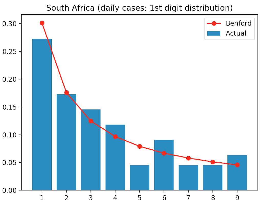
   Number  Count  Frequency   Benford
0       1     30   0.272727  0.301030
1       2     19   0.172727  0.176091
2       3     16   0.145455  0.124939
3       4     13   0.118182  0.096910
4       5      5   0.045455  0.079181
5       6     10   0.090909  0.066947
6       7      5   0.045455  0.057992
7       8      5   0.045455  0.051153
8       9      7   0.063636  0.045757
All that is now left to do, is to graph the actual digit frequency against the expected frequency as predicted by Benford’s Law. The digits are plotted on the x axis and the frequency on the y axis, using a bar chart for expected frequency (Benford) and a line graph for the actual frequency:
# graph the actual digit frequency
plt.bar(df_digit['Number'], df_digit['Frequency'], label='Actual')
# graph the Benford digit frequency (marker 'o' line '-' colour 'r')
plt.plot(df_digit['Number'], df_digit['Benford'], 'o-r', label='Benford')
plt.title('{} (daily cases: 1st digit distribution)'.format(country))
plt.legend(loc="upper right")
plt.xticks([1,2,3,4,5,6,7,8,9]) # show all x ticks
plt.show()

Studying the chart, we can see that the digit frequency for new daily COVID-19 cases in South Africa seems to somewhat follow Benford’s Law, with some digits less aligned than others.
Although the total number of digits observed of 110 is lower than an ideal situation to perform a Benford’s Law analysis (the more data the better), it is however interesting that some digits are significantly out of alignment with their expected frequency, which could be an indication that further analysis may be warranted.
Feel free to experiment with changing the target country to see if you get any other interesting results.
The code for the above analysis, as always, can be downloaded from my Github repository.